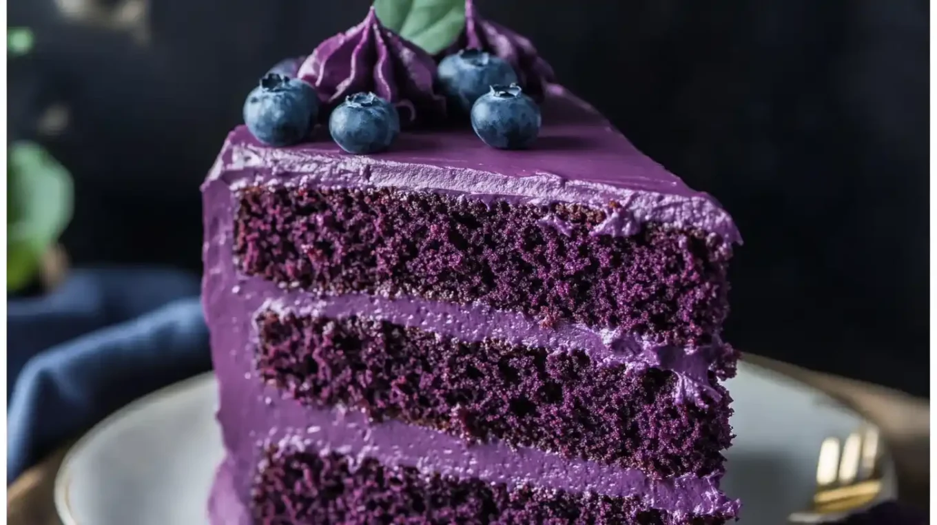
Purple is a powerful visual cue. It can suggest blackberry, elderberry, grape, acai, or a premium botanical product before the consumer reads a single word on the label. It can also look artificial very quickly if the shade is too blue, too dark, or disconnected from the flavor.
The challenge is to build depth without losing believability. Product developers need to consider acidity, base color, dosage, processing, and the expected flavor profile together, because a technically accurate shade can still feel wrong for the product.
Use a Real Product as the Shade Reference
Color chips are helpful for communication, but food appearance depends on opacity, gloss, serving depth, and lighting. A beverage in a clear bottle and a yogurt in an opaque cup can use similar pigment systems yet look completely different.
Create the target in the actual product matrix whenever possible. If a competitor sample or existing SKU is the reference, compare under the same light and container thickness. That avoids chasing a color that only exists on a screen.
Elderberry Can Support Dark Fruit Tones
Elderberry Color is associated with anthocyanin pigments that can contribute red-purple shades, particularly in acidic applications. Its performance still depends on pH, heat, light, and the rest of the formula.
Developers should test more than one dosage. A lower level may produce a fresh berry red, while a higher level can become much deeper and more purple. The most intense sample is not automatically the most appealing.
Purple Needs the Right Undertone
When selecting a purple color for food, teams should decide whether the target leans red, blue, or neutral. That small distinction can determine whether the finished product reads as berry, grape, floral, or something less familiar.
Blending may be more effective than forcing a single pigment to hit every target. The formulation should be tested after processing because heat and pH can shift undertone, especially in products where natural ingredients already contribute background color.
The Base Product Can Make Purple Look Dull
Proteins, cocoa traces, whole-grain ingredients, fruit solids, or cloudy beverage bases can reduce brilliance. In those systems, adding more pigment may create darkness without producing the clean saturation the team expects.
Check the uncolored control next to every trial. Sometimes the problem is not pigment strength at all; it is the brown, cream, or gray background of the food. A realistic target should work with that base rather than pretending it is transparent.
Packaging Can Change the Consumer’s View
Purple products often rely on visual impact at retail, which makes clear packaging attractive. The same choice can increase light exposure. A pigment that is stable in an opaque laboratory container may shift faster in a transparent bottle or cup.
Run storage tests in the commercial package, including likely retail lighting. Label coverage, package tint, and secondary cartons can all affect exposure. Packaging and color should be developed together when visual shelf appeal is central to the concept.
Do Not Let Color Overpromise the Flavor
A very dark purple can make consumers expect an intense berry profile. If the flavor is light, floral, or only mildly fruity, that contrast may make the product taste weaker than it really is.
Sensory work should include appearance as well as flavor. Ask whether the color feels believable for the named flavor and whether it changes sweetness or fruit-intensity perception. Those responses can guide the final shade more effectively than technical measurements alone.
Check How the Shade Looks at Real Serving Depth
A purple beverage in a shallow laboratory cup can appear much lighter than the same drink in a full bottle. Yogurt, frosting, and fruit fillings also change visually when the viewing depth increases.
Evaluate the product in the container and portion size consumers will actually see. This prevents teams from over-darkening a formulation simply because early screening was done in thin layers.
Conclusion
A convincing berry or purple shade comes from balancing pigment chemistry with flavor cues, base opacity, packaging, and dosage. Depth is useful, but the strongest-looking sample is not always the most natural or appealing.
Product teams can explore berry and purple color systems and technical support at foodrgb.com. Using a realistic shade guide and checking the color in the package helps to maintain a color that is distinctive but not all on its own.